Copperplate 55°
5 mm x-height, 13 rows
Ascender, x-height, baseline and descender lines, with 52°, 55° or 60° slant lines. Choose an x-height from 3 to 10 mm and print a true-size sheet.
Common setups for pointed pen and brush. PDF prints Letter; the second button prints A4.
5 mm x-height, 13 rows
5 mm x-height
3 mm x-height, 23 rows
7 mm, no slant lines
10 mm x-height, 7 rows
Long rows, 55° slant
Calligraphy paper gives every row four guidelines and, if you want them, slant lines at a fixed angle. Set the x-height and slant for your script, print a sheet, and drill the same letter until it repeats.
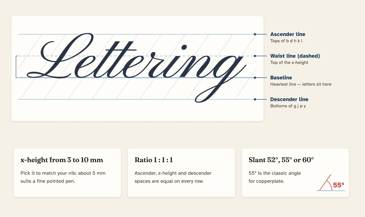
| Line | What touches it | How it is drawn |
|---|---|---|
| Ascender line | Tops of b, d, h, k, l and capitals | Thin, at the top of the row |
| Waistline | Tops of a, c, e, m, n, o, s | Dashed, one x-height above the baseline |
| Baseline | Every letter sits on it | Bold, so the eye finds it first |
| Descender line | Tails of g, j, p, q, y | Thin, one x-height below the baseline |
The three spaces are equal, a 1:1:1 ratio. After each row there is a gap of 0.6 x-height so loops from one row do not land on the ascenders of the next. The sheet starts 0.75 inch from the top and keeps a half-inch margin at the sides and bottom.
The x-height is the only measurement you set; the whole row scales from it. Match it to your tool and your exemplar.
| x-height | Rows on Letter | Rows on A4 | Suits |
|---|---|---|---|
| 3 mm | 23 | 24 | Pointed pen, advanced; small finished pieces |
| 4 mm | 17 | 18 | Pointed pen once letters are steady |
| 5 mm | 13 | 14 | Pointed pen; the default and a good start |
| 6 mm | 11 | 12 | Small brush pens, broad-edge 1 mm nibs |
| 7 mm | 9 | 10 | Brush lettering, broad-edge 1.5 mm nibs |
| 8 mm | 8 | 9 | Medium brush pens |
| 10 mm | 7 | 7 | Large brush pens and markers |
For broad-edge pens, x-height is usually counted in nib widths: italic is commonly written about five nib widths high. Measure your nib, multiply by five, and pick the nearest step. If your book shows taller ascenders than x-height, keep the x-height that matches and treat the ascender line as the minimum, not the limit.
Slant lines are measured from the baseline, so 90° would be upright. The sheet offers the angles most scripts use:
The slant lines are drawn thinner than the guidelines, about one every 1.6 x-heights, so they guide your downstrokes without crowding the row. Line them up with each downstroke rather than with the letter as a whole.
Print a stack in one go: set Pages to 10 and turn on Page numbers to keep a dated practice log. Type a title such as “Week 3 — n m v x” to label each sheet.
Calligraphy guidelines grew out of the same idea as school handwriting paper: a top line, a midline and a baseline. The difference is the extra descender line and the slant. If you are teaching a child cursive, start on handwriting paper and come here once letter size is steady.
For finished pieces such as letters and cards, move from guide sheets to writing paper, which has single wide lines and a border. To keep your new hand going between sessions, write everyday notes on college ruled paper with the same care.
They are rows of four lines: the ascender line at the top, the waistline (x-height line), the baseline and the descender line. Small letters sit between the baseline and the waistline; tall letters rise to the ascender line and tails drop to the descender line.
Beginners with a pointed pen often start at 5 or 6 mm, which is the default here. Drop to 4 or 3 mm as your control improves. Small brush pens suit 6 to 8 mm and large brush pens 8 to 10 mm.
Copperplate and engrosser’s script are usually written at 55°, measured from the baseline. Spencerian is often given as 52°. Choose either under Slant, or 60° for a gentler lean.
Ascender, x-height and descender are the same height: a 1:1:1 ratio. With a 5 mm x-height each row is 15 mm from ascender line to descender line, followed by a 3 mm gap before the next row.
At 5 mm x-height a Letter page has 13 rows, A4 has 14 and Legal has 18. At 3 mm Letter has 23 rows; at 10 mm it has 7.
Yes. Set Slant to None for upright scripts, brush lettering in a vertical style, or italic, whose slight lean is easier to keep by eye.
Plain copy paper makes most inks feather. Print on a smooth, heavier paper such as 32 lb (120 g/m²) laser paper, or print on copy paper and lay layout paper over it so the lines show through.
Yes. Download the PNG or PDF and import it as a page background in a drawing or notes app. The lines stay crisp because the PDF and SVG are vector files.